Rebuilding BitGo
A new visual language and brand system built to move with BitGo as the company grew.
Client:
BitGo · Masterbrand
Brand System
01 · The brief
When I joined BitGo in 2022, the brand looked like a lot of fintech companies at the time: light blue, white backgrounds, serif headlines and stock illustration. It worked, but there wasn’t much that made it feel like BitGo.
I wanted to build something darker, more minimal and more ownable: a brand that felt closer to the scale and maturity of the company behind it.
But whatever we made also had to work beyond a few great launch assets. It needed enough structure that our team, agencies and partners could keep building with it without the brand slowly changing along the way.
So I worked on the look and the system behind it at the same time.
02 · Building a material
I wanted BitGo to have more than a color palette. I wanted it to have a material.
That became metallic glass.
The direction came from outside of crypto: watches, jewelry, automotive photography and the way those industries use light and material to make something feel valuable.
I spent months exploring the look across 3D and image generation until it started to feel like something we could own.
Dark glass. Machined edges. Hard light. Shallow depth of field. Small moments of color moving through an otherwise restrained palette.
From there, the challenge was making it repeatable.
I defined how the material is lit, photographed, composed and used across the brand. Those rules let us create hundreds of different objects and scenes without reinventing the style every time.


03 · The system
The rest of the brand needed the same treatment.
Our guidelines and working files had drifted apart over time. Rules lived in different places, templates were inconsistent, and too many decisions depended on someone already knowing the answer.
I rebuilt the foundation around how we actually work: type, color, spacing, effects, motion, components, templates and usage.
The goal wasn’t to document every possible decision. It was to make the right decisions easier to repeat.
That meant putting as much thought into the templates as the guidelines themselves. A designer shouldn’t have to read a brand book every time they open a file. Most of the system should already be there.


04 · Where it runs
The website became the first big test.
I redesigned more than 60 pages of bitgo.com around the new system, using type to carry more of the layout and metallic glass more selectively.
Motion followed the same direction. Slower movement, controlled light and enough restraint that product demos, launch films and brand graphics could all feel like they came from the same place.
From there, the system expanded across campaigns, social, product marketing, sales, events and physical spaces.
Different formats needed different answers. The important part was knowing what could change and what always had to feel like BitGo.
05 · The family
As BitGo’s product portfolio grew, not everything needed to look exactly the same.
The challenge was giving individual products enough personality to stand on their own without creating a collection of unrelated brands.
Prime Services, Crypto as a Service and Stablecoins each use their own color territory while keeping the core system intact.
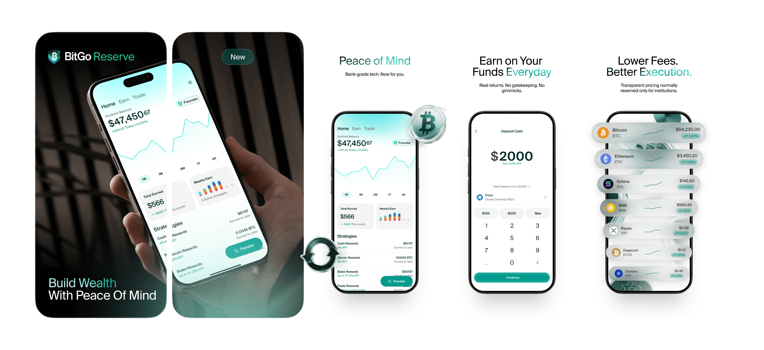
BitGo Reserve pushes it further. It’s more consumer-facing, so the palette gets brighter and the material shifts toward metal rather than glass. The expression changes, but it still comes from the same foundation.
Building the brand was one challenge.
Figuring out how a small team could make more of it, faster and without losing the quality, became the next one.