01 · The listing
BitGo went public on the New York Stock Exchange in January 2026. It was the biggest stage we’d put the new brand on.
I led the creative direction and design across the launch, from Times Square and the NYSE to the launch film, social, print, merch and the spaces around it.
We weren’t creating a new identity for the IPO. We were taking the system we’d already built and seeing how far it could go.
The same visual language had to work on a Times Square screen, across the NYSE, on a truck, in a newspaper and embroidered on a pair of socks.

02 · Times Square
The campaign centered on one line:
History repeats itself. Until now.

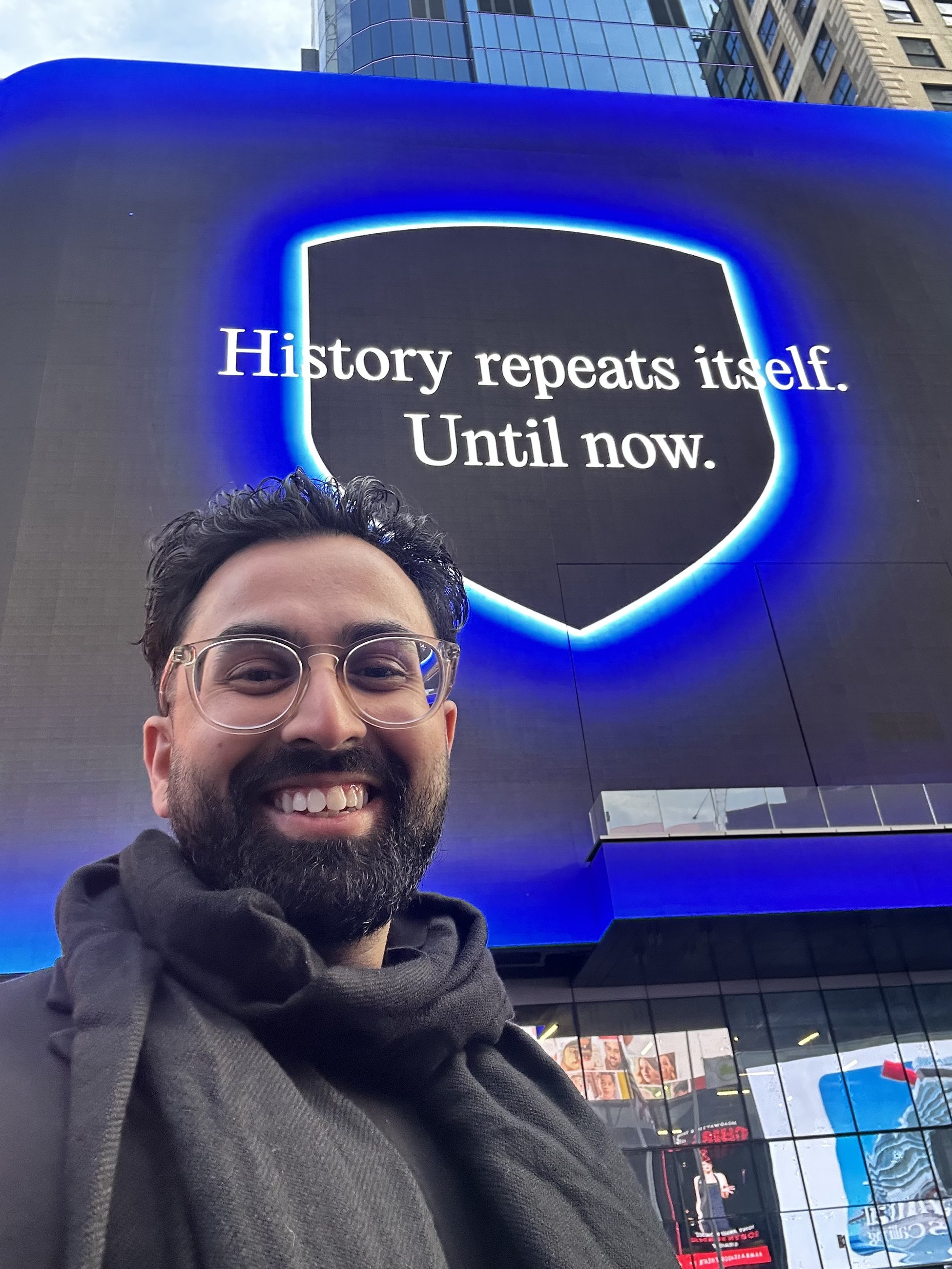
For Times Square, we kept everything else simple. No product UI, no feature list, no complicated message. Just the line, the brand and the shield.
The motion came from the launch film and was built to read quickly from across the intersection.

03 · The exchange
Designing for the room and the cameras
At the NYSE, the brand moved across the facade, floor screens and podium.
Everything needed to work in the room, but we also knew most people would experience it through someone else’s camera.
Broadcast. Press photography. Tight crops. Wide shots.
The work had to hold up in all of them.


04 · Beyond the exchange
The launch stretched well beyond the NYSE.
We wrapped a truck outside, created launch-day merch, dressed the BitGo office and printed a one-day newspaper called The Block Street Journal.
These were smaller moments than Times Square, but together they made the day feel like BitGo everywhere you encountered it.


From a building-sized screen down to a pair of socks, it all came from the same system.
Credits
Creative direction and design: Tarun Dhiman
Print, environmental and vehicle graphics: Tarun Dhiman & Shaoyin Chow
NYSE floor photograph: Michael Nagle, Bloomberg via Getty